Points of Sale: 5 Exhibit Design Trends at NRF
How to apply merchandising magic (inspired by Retail’s Big Show)
No one knows retail, customer experience, and the power of selling like the National Retail Federation (NRF) and its annual NYC event, Retail’s Big Show — this is where retail brands go to find the latest tech innovations to elevate customer experience and increase sales.
The vast expo offers a window into effective exhibit merchandising — aka, effective exhibit strategy — at a show where retailers are the target consumers.
To stand out and get more results, brands at NRF design spaces that appeal to attendees — captive consumers who come ready to buy.
Our team browsed the expo to scout design and merchandising trends attracting show floor shoppers.
Here are five approaches that stood out:
1. Curate your space
Think about that moment when you walk into a store (no matter the size). Whether it’s carefully curated like a boutique or cluttered like an outlet, you feel the difference.
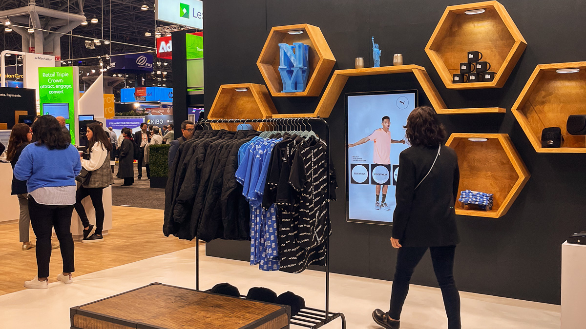
Displays don’t have to be couture to be enticing — it’s all about presentation:
- Get organized: Treat products and demos like merchandise — clean, uncluttered, easy to find. This approach makes the space appealing to look at and inviting to come inside.
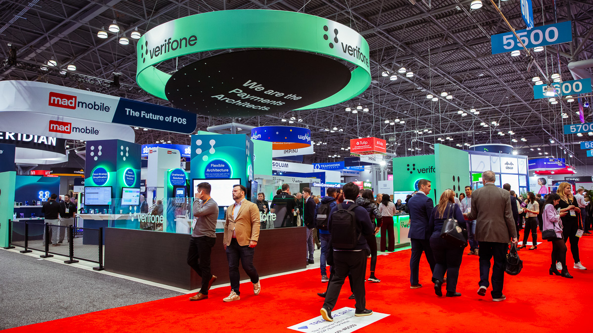
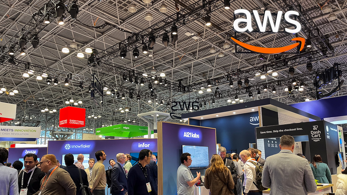
- Feature lighting: Pops of neon and LEDs (lights and bright LED screens) add emphasis to key demos and products while also adding visual interest. Unexpected overhead lighting can also pack a punch … we’re looking at you, NCR Voyix!
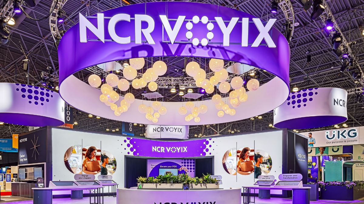
- Put color to work: Monochromatic spaces (with similar color schemes across signage, furniture, uniforms, and more) look clean and organized, which catches the eye. Colored lighting can highlight products and create a mood — think tranquil blues that evoke a spa or beach and shades of green for a natural nod. Using color strategically for wayfinding within larger footprints also helps visitors easily navigate your offerings.
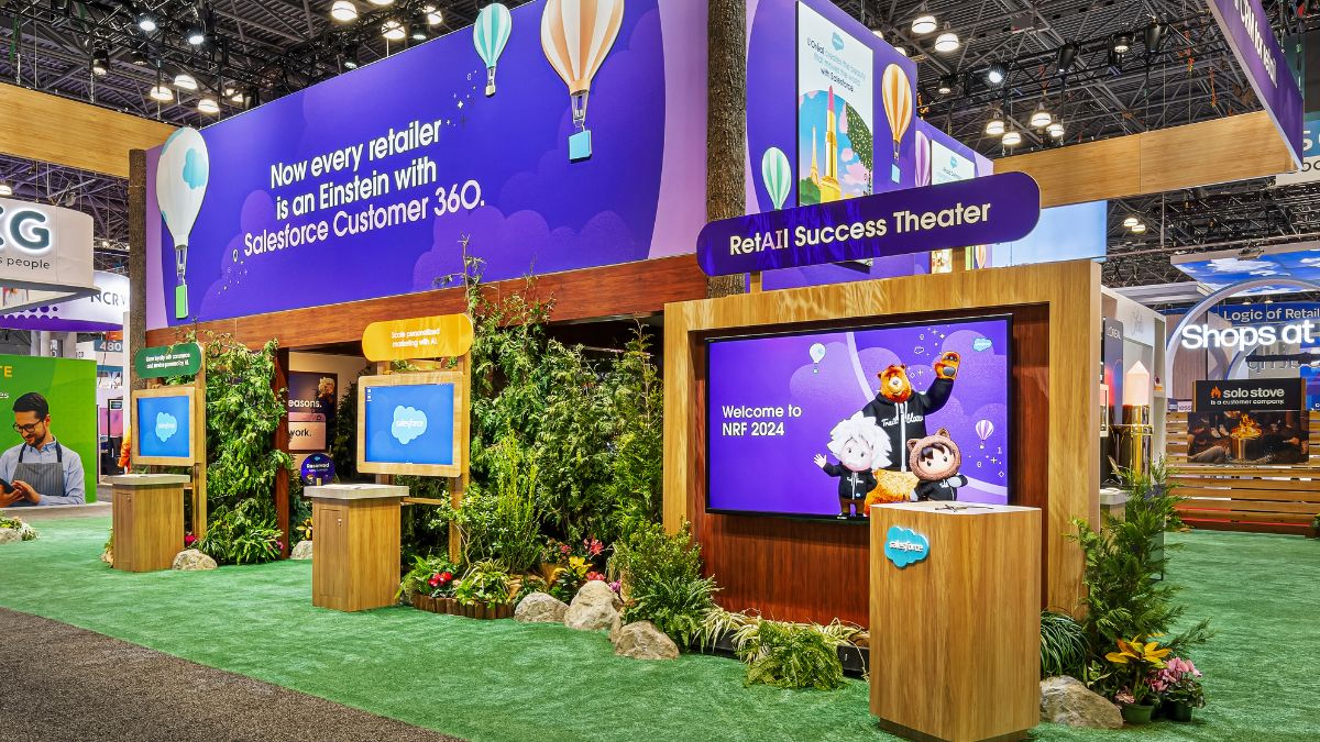
- Bring the outside in: Adding flora and fauna to exhibits isn’t revolutionary, but the value can’t be overstated. Bottomline: Plants and greenery add a warm welcoming vibe, soften tech-heavy spaces, and can be used strategically to separate the booth sections.
2. Streamline your offerings
Organization applies to the design of your space, your messaging, and the products/services. Trade shows bustle with activity, so make it easy on overwhelmed attendees. Prioritize what’s being presented and communicated:
- Choose products or services that work within the space (less truly is more).
- Make sure the assortment aligns with your organization’s goals.
- Unify (and simplify!) signage, graphics/imagery, and wayfinding so visitors can find what they’re looking for, fast.
“Do less. There’s a lot of competition, a lot of noise. To me, the brands that stand out are the ones that are thoughtful in considering the audience.” – Dan Carter SVP, Creative+Design, Freeman
3. Consider your consumer (Part 1): Make it flexible
Simplifying your product offerings is just one part of keeping your audience and your exhibit visitors in mind. Design a thoughtful journey:
- Don’t overwhelm — less is more here, too. Map the journey in bursts by breaking down each solution/product area and clearly communicate how it benefits the visitor.
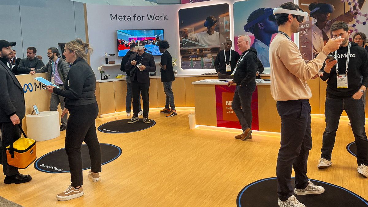
- Personalization is key — Let visitors drive the experience so they can choose where to go first based on their needs and interests and how much or how little they want to engage.
- Plan for different consumers — Welcome introverts and extroverts with spaces, activations, and staff (more on them below) that meet their needs.
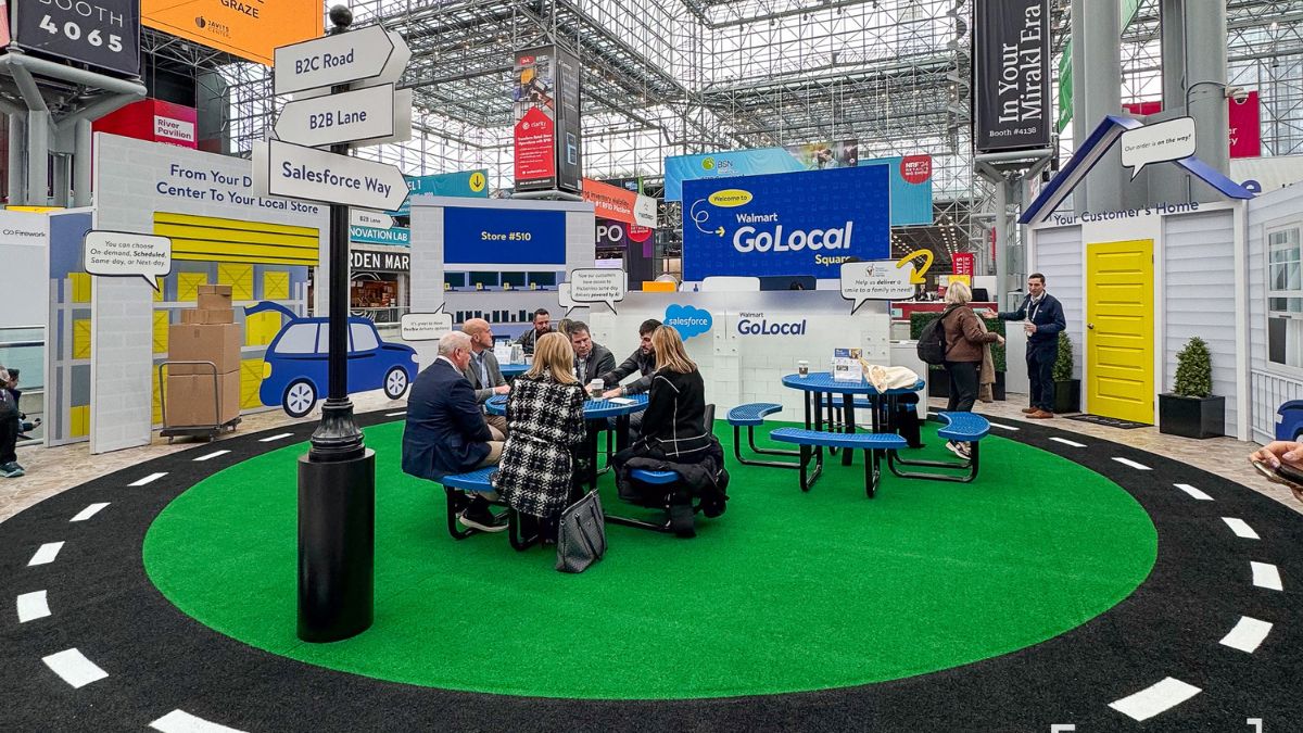
- Co-op the space — If applicable, work with your partners to highlight use cases of how your product is positively affecting the end user. This approach benefits the attendee because they learn about the solution and can see (and sometimes touch) results. This also benefits you and the partner — they get to promote their brand while contributing to and amplifying your organization’s goals.
4. Consider your consumer (Part 2): Offer breathing room
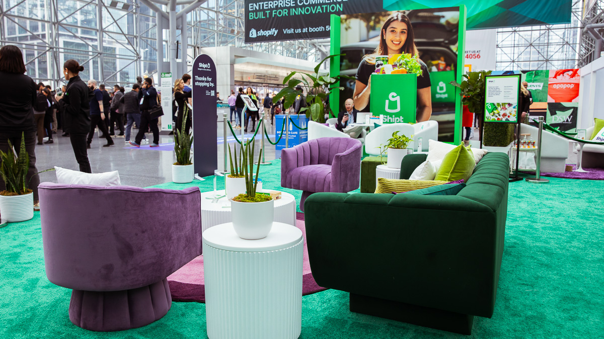
Not every brand has a huge space to orchestrate multiple experiences, including relaxation. But regardless of the space, it’s important to provide a place for visitors to hang their hat. Even a single comfy chair can provide a welcomed retreat.
With larger spaces, consider seating in addition to meeting rooms. By including a lounge area, you give people a soft place to land where they can take a break and/or make a spontaneous connection. Offering a respite within your booth means they might be ready to hear more after a breather.
5. Balance (and brief) your booth team
People working your booth may not be on display (technically), but they do represent your brand. Assemble a more effective team with a balanced mix of product experts, sales people, and marketers who know the brand.

Each team member should be clear on your exhibit goals, product/services being promoted, and the story behind your theme, mascot, logo, etc. It’s a big miss when someone wants to understand why your exhibit has an outer space theme and the person they ask isn’t sure — educate your team so attendees aren’t left in the dark.
Apply merchandising magic for a better booth experience
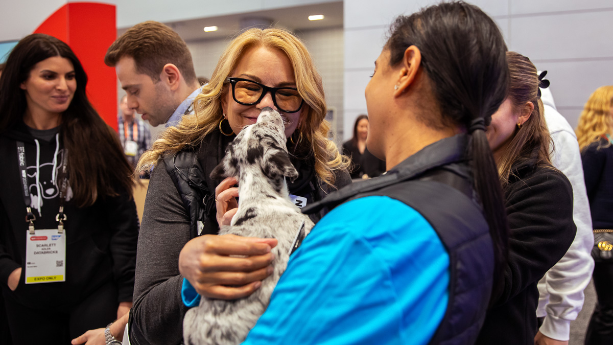
All puppies aside … when you think like a retailer, you can create an inviting and organized space that beckons visitors to come inside. And if they like what they see and enjoy the experience, they’ll be more likely to buy.
Ready to design an exhibit that captures attention and closes sales?
Let’s talk shop
